The Making of This Site
TL;DR: I moved from WordPress to a superfast static site. Here’s the source code.
This is not my first site. I’ve had a WordPress blog hosted on this domain since 2013. And I recommend WordPress to anyone who wants their own site but cannot write HTML and CSS.
Then why did I move away from it? Because I can. As an experienced web developer, I was itching to write my own site by hand. Reasons being:
- I wanted to tune the performance and accessibility in very specific ways.
- I wanted it to be a static site, which makes it inherently faster than WordPress.
- I wanted to add personal style and navigation that was only possible if I wrote the code myself.
And thus began my hunt for the right tools.
Static Site Generator
A static site generator is a program which takes your content and puts it into nice-looking HTML pages. You can then host these on any static web server. No back end needed.
There’s no shortage of such generators on the internet. But I needed something that could build my site in milliseconds, even on my low-end hardware. This led me to two choices: Hugo and Zola.
After trying them both for a while, I decided to go with Zola for its relative simplicity and ease of learning.
I knew I’d miss out on the huge community that comes with Hugo. But thanks to Zola’s excellent documentation and forum, I rarely felt stuck. The number of community themes was irrelevant to me since I planned to write my own.
Turbolinks Turbo
One day, I landed on a post on taniarascia.com from a web search. The site looked so clean that I decided to explore it, and was floored by how fast the navigation was. Unvisited pages opened as if they were stored offline. Something was fishy.
I dug around the site to find a post about how it was made (much like this one). It uses Gatsby, which turns the site into a single-page application. Each page load is a JSON call, and even that is likely preloaded by the current page.
I had no intention of switching away from Zola, but I wanted this superpower. I remembered seeing a GitHub repo that can do something similar to a site using traditional navigation. I peeped into my Pensieve (read: Firefox history) and came out with Turbolinks. (Update: Now using Turbo, the successor to Turbolinks.)
This library hijacks all same-origin hyperlinks on your site and fetches them in the background. Then, without causing a full page reload, it swaps out the <body> and merges the <head>, making navigation blazing fast. This way, you can still use old-school hyperlinks and your site will behave like a single-page application.
The best part about Turbo that there’s nothing to configure. Load it in a <script> and it starts working. And if a browser doesn’t support JavaScript, links work like they always have. Everybody wins!
Which brings me to—
Progressive Enhancement
It shouldn’t take a read-through of Resilient Web Design to understand the importance of progressive enhancement. My site had to work on everything from a command-line browser to a full-blown Firefox.
And that’s easy. Use accessible, semantic markup, and serve it without any client-side DOM manipulation. Everything else is an addition. Even CSS.
Snazzy Underlines
I was itching to use the new underline styles now possible with pure CSS. At the time of writing, they only fully work on Firefox. How do I not break over 90% of the web for some snazzy effect I felt like adding?
Feature queries to the rescue.
CSS supports the @supports at-rule to detect whether the browser supports a declaration. Then you can write separate styles for supporting and non-supporting browsers.
The only problem is IE support. It doesn’t support @supports, so I don’t support it.
Fine, I’ll stop saying ‘support’.
Keyboard Navigation
You can navigate the menus and lists on some pages using arrow keys and Vim-style HJKL keys. You’re welcome.
This is a feature that games and CLI apps offer out of the box but is rare on the web. I wrote some JavaScript to enable it where it makes sense.
This is another progressive enhancement. You can still click the links as usual, with or without JavaScript.
Design
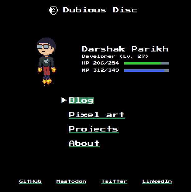
I felt I should let my retrogaming interest ooze into my site, so I originally designed it to look like a game straight out of 1990.
The font I’d have used for headings and menus was Press Start 2P.
This is also why I wanted keyboard navigation: to emulate a game controller.

That dream did not last long.
I picked the brilliant Recursive font for body text. I tried it on headings too, and it looked so good that I dropped the whole blockiness idea and used Recursive for everything.
Update 2020-09-28
After publishing the site online, I found myself writing about serious topics, and Recursive didn’t seem to fit the image of “serious”. But I was cautious about adding multiple fonts since Recursive offered so much in one font resource.
After reading some typography advice from Erik D. Kennedy and Jeremiah Shoaf, I decided to try a few different approaches to font selection. Some experimentation with Google Fonts and many iterations led me to what you see today: serious, but not too much so.
I even added a nice light color scheme, which looks even better than the dark one with the new typography.
Update 2020-10-03
I rebranded from Dubious Disc to prose&const and refreshed the home page and navigation styles. Again, I applied the UI design lessons learnt from the two brilliant folks mentioned above.
Moreover, I no longer have to compete for search results with Pokémon.
Performance

Need I say more?
Final thoughts
While this lacks many common features, I am happy with the result. It’s fast, responsive, privacy-respecting, open source, and most importantly, it’s mine. It is exactly how I want it to be.
I recommend this to anyone who knows HTML and CSS (and has the time): if you want to make a site, write it yourself. Not only does it give you street cred and bragging rights, it is also more satisfying and rewarding. And of course, you learn a lot along the way.